TitleBar
You can use RedCorners.Forms.TitleBar to add customizable title bars to your views. In order to use TitleBar in XAML, first you need to include the namespace inside your root element:
xmlns:rf="clr-namespace:RedCorners.Forms;assembly=RedCorners.Forms"
Video: https://www.youtube.com/watch?v=EUuuqSCjZ_Y
TitleBar offers superior functionality compared to the traditional navigation page title bar. This is mainly because TitleBar derives from ContentView2, making it a true native Xamarin.Forms View, which can be embedded into any other View. Because of this, you can have TitleBars anywhere on the screen, and be able to quickly move it around on designers’ demand, without having to rewrite the entire UI.
TitleBar powers the TitledContentView control, which is the best way to create a titled page experience in Xamarin.Forms. For more information, read the docs on TitledContentView.
The most basic TitleBar contains a back button and a text. You can define it like this:
<rf:TitleBar Title="Hello, World!" />
If you are in a modal page and you want to have a back button that pops the modal page, you can use the default PopCommand like this:
<rf:TitleBar
    Title="Explore"
    IsBackButtonVisible="True"
    BackCommand="{Static rf:Values.PopCommand}" />
Properties
View Background
This optional bindable property allows you to set any Xamarin.Forms View as the background of the TitleBar. You can use this to put a custom background image on the TitleBar, or even an animated GIF!
<rf:TitleBar
    Title="Custom Background"
    IsBackButtonVisible="True"
    BackCommand="{Static rf:Values.PopCommand}">
    <rf:TitleBar.Background>
        <Image Source="https://freefrontend.com/assets/img/css-background-patterns/simple-pattern-with-css3.png" HorizontalOptions="Fill"
        VerticalOptions="Fill"
        Aspect="AspectFill"
        HeightRequest="1" />
    </rf:TitleBar.Background>
</rf:TitleBar>
Note: If you want an Image to fit the background and not mess with the size of the TitleBar, you have to set a small HeightRequest on it, even if its VerticalOptions is set to Fill. Without setting a HeightRequest, it expands the TitleBar and ruins your design.
.png)
<rf:TitleBar ...>
<rf:TitleBar.Background>
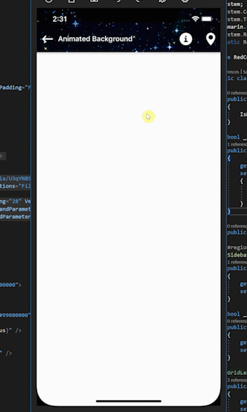
<ff:CachedImage
Source="https://media.giphy.com/media/U3qYN8S0j3bpK/giphy.gif"
HorizontalOptions="Fill"
VerticalOptions="Fill"
Aspect="AspectFill"
HeightRequest="1" />
</rf:TitleBar.Background>
...
</rf:TitleBar>
View ToolBar
You can assign a View to the ToolBar property to add buttons and other visual elements on the ToolBar. In XAML, if you add an element inside the TitleBar, it automatically gets assigned to the ToolBar:
<rf:TitleBar
    Title="Buttoned TitleBar"
    IsBackButtonVisible="True"
    BackgroundColor="#c62828"
    BackCommand="{Static rf:Values.PopCommand}">
    <StackLayout Orientation="Horizontal" Spacing="28" VerticalOptions="Center">
        <rf:ImageButton2
            Source="menuabout"
            CommandParameter="About clicked!"
            Command="{Binding MessageCommand}"
            HeightRequest="28"
            WidthRequest="28" />
        <rf:ImageButton2
            Source="menumap"
            CommandParameter="Pin clicked!"
            Command="{Binding MessageCommand}"
            HeightRequest="28"
            WidthRequest="28" />
    </StackLayout>
</rf:TitleBar>
Note: Use rf:ImageButton2 instead of Xamarin.Forms’ built-in ImageButton. It’s much cooler!
.png)
.png)
View TitleView
This optional property renders a custom View instead of the title label. By default it is null, and if it is assigned, the title label disappears. It provides a great way to add image logos on the title bar.
To adjust the position of the TitleView, you can use the TitleAlignment property.
double ContentHeightRequest, Thickness ContentMargin
ContentHeightRequest controls the height of the inside of the TitleBar. ContentMargin sets the margin of the inside container, and its default is set to 0:
<rf:TitleBar
    Title="Custom Height"
    IsBackButtonVisible="True"
    BackgroundColor="#c62828"
    BackCommand="{Static rf:Values.PopCommand}"
    ContentHeightRequest="100" />
.png)
LayoutOptions VerticalOptions, bool FixTopPadding, bool FixBottomPadding
You can move the TitleBar anywhere, and one way of doing this is by setting its VerticalOptions. If you set VerticalOptions to End in a Grid, you will get a bottom bar.
To compensate for different safe insets on iOS devices (e.g. iPhone X series), you can set FixTopPadding="True" if your TitleBar is on top, and FixBottomPadding="True" if your TitleBar is on the bottom:
<Grid BindingContext="{Reference vm}" RowSpacing="0">
    <Grid.RowDefinitions>
        <RowDefinition Height="*" />
        <RowDefinition Height="Auto" />
    </Grid.RowDefinitions>
    <rf:HorizontalShadow2 />
    <rf:TitleBar
        Grid.Row="1"
        Title="Bottom TitleBar"
        IsBackButtonVisible="True"
        BackgroundColor="#c62828"
        BackCommand="{Static rf:Values.PopCommand}"
        FixTopPadding="False"
        FixBottomPadding="True">
        <StackLayout Orientation="Horizontal" Spacing="28" VerticalOptions="Center">
            <rf:ImageButton2 Source="menuabout" CommandParameter="About clicked!" Command="{Binding MessageCommand}" HeightRequest="28" WidthRequest="28" />
            <rf:ImageButton2 Source="menumap" CommandParameter="Pin clicked!" Command="{Binding MessageCommand}" HeightRequest="28" WidthRequest="28" />
        </StackLayout>
    </rf:TitleBar>
</Grid>
.png)
bool? IsBackButtonVisible, ImageSource CustomBackImage
If you wish to use a custom image for the back/menu button, you can set CustomBackImage to your image. Otherwise, a default icon (either the hamburger menu or a back arrow) is shown, depending on the value of IsBackButtonVisible.
- If
IsBackButtonVisibleis set totrue,TitleBarassumes that it is in a modal page and shows a back arrow icon for the back button. - If
IsBackButtonVisibleis set tofalse,TitleBarassumes that it is in a top-level page and shows a hamburger menu icon for the back button. - If
IsBackButtonVisibleis not set (default behavior), it looks at theIsModalproperty of the binding context, assuming aBindableModelis its view model. Depending on theIsModalproperty, it does one of the above scenarios. If the binding context is not aBindableModel, it shows the default icon, which is the back arrow.
These properties are ignored if LeftToolBar is specified, or HasButton is false.
bool IsDark
In case default images for the back button are used, IsDark toggles between white and black versions of icons. Default is false, which means white default icons are used.
bool HasButton
This property toggles the visibility of the default back button. By default it is true.
View LeftToolBar
By default, this property is null. If specified, instead of the default back button, this view is shown. This can act as a secondary toolbar on the left side of the title bar.
ICommand BackCommand, object BackCommandParameter
You can use these bindable properties to set the behavior of the back button. For example, to pop a modal page, you can do this:
<rf:TitleBar
    Title="About"
    IsBackButtonVisible="True"
    BackCommand="{Static rf:Values.PopCommand}" />
Color TextColor, double FontSize, string FontFamily, FontAttributes FontAttributes
You can use these bindable properties to customize the appearance of your TitleBar’s text.
TitleAlignments TitleAlignment
This specifies the text alignment of the title text, or the alignment of the TitleView. If it is set to Center, the text/view aligns itself at the very center of the title bar. Otherwise, it aligns itself after the back button / LeftToolBar and before the ToolBar, depending on its value (Start or End).
The TitleAlignments enum is identical to the TextAlignment enum of Xamarin.Forms.